Nasdaq · Information architecture · 2025–2026
Rebuilding How Investors Navigate Nasdaq.com
I designed, prototyped and built out 60% of the redesigned sitemap and navigation, which launched in Q3 2026, while leading a four-person content team.
Role
UX Content Designer, IA owner for 60% of the site
Team
Led 4 Web Production Specialists; partnered with PMs, developers, UX/UI designers and product marketers
Timeline
June 2025 – Q3 2026 launch
Tools
Figma, Drupal


The Problem
Nasdaq.com had grown into a sprawl of market data, news and company pages. Retail investors, professionals and listed companies all landed in the same tangled navigation.
Content was wildly inconsistent and didn't follow a clear hierarchy, so similar pages were structured, labeled and nested differently.
Goal: A structure that matched how each audience looks for information, on a CMS teams could update quickly.
Process
01
Audit & Analytics
Mapped the existing sitemap against real traffic and drop-off.
02
Usability Insights
12+ user testing sessions. The surprise: people disliked dark mode, which changed our direction.
03
New IA
Restructured sitemap and navigation around user tasks.
04
Content-First Prototypes
Figma prototypes with real copy and interactions built in.
05
CMS Requirements
Reusable Drupal content models to keep it maintainable.
The Audit: Cut Before You Rebuild
Before designing a single new page, I tested every existing page against two rules. About 15% failed and were retired or folded into stronger, higher-level pages.
Rule 1 · Traffic
Fewer than 200 page views in 90 days
Rule 2 · Value
Low lead generation
Result
Less to rebuild, and a cleaner hierarchy to build on
Built for Hierarchy and Flexibility
The 23/5 Trading Information Hub shows the new structure at work. It moves readers from the headline announcement down through context, explanation, expert voices and deep resources, and each layer can grow or shift as the story changes. Scroll the page to see it.
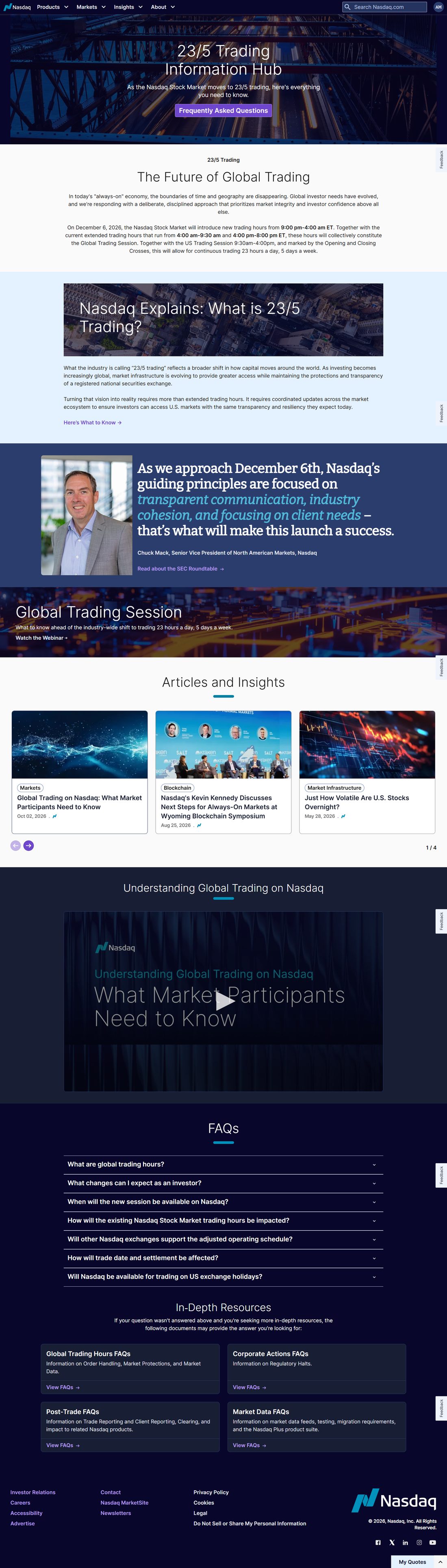
The Content Hierarchy, Top to Bottom
- Announce: the hub hero and the key question
- Context: what's changing and when
- Explain: "Nasdaq Explains" in plain language
- Expert voice: leadership perspective
- Go deeper: webinar, articles and video
- Answer: FAQs for common questions
- Reference: in-depth resources by audience
Key Decisions
Cut the Fat Before Rebuilding
Why: Pages under 200 views in 90 days, or with low lead generation, could fold into higher-level pages and shorten the rebuild.
Tradeoff: Retiring pages teams owned meant making the case with data.
Flexible Cards, Not Rigid Templates
Why: Cards that retrofit existing content kept the new, cleaner look without rewriting everything.
Tradeoff: More upfront component design and development.
Drop Dark Mode Midflight
Why: In testing, people were less inclined to like the dark mode screens.
Tradeoff: Rework on designs already in progress.
Outcomes
25%
fewer stakeholder review cycles
40%
faster content updates in Drupal
Q3 2026
new experience launched
Next case study
Simplifying UPS.com for Customers in 220+ Markets
Some details are simplified for confidentiality. Happy to walk through more in conversation.